One of the biggest reasons a business carries out a rebrand is to re-establish itself in their current market and they want to broaden their appeal with potential customers.
In 2022, we saw some significant companies rebranding and noticed them taking on a more sophisticated and simplistic look.
Taking out unnecessary elements and going back to simple colours and graphics makes it easier for people to remember and refreshing the brand in consumers minds.
In this blog post we have looked at some of our favourite rebrands from the year.
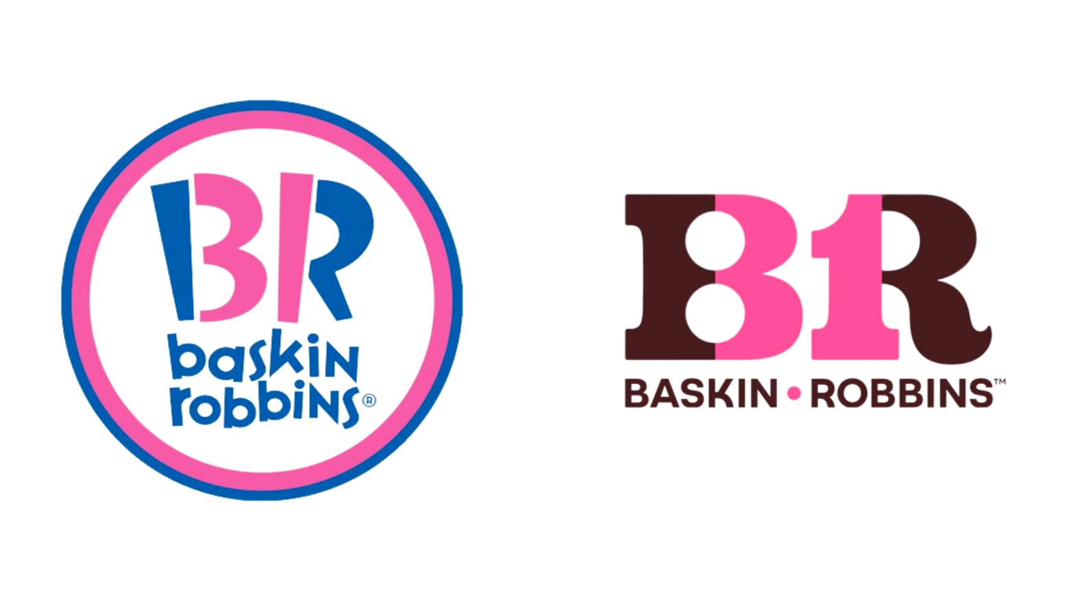
Baskin Robins
After 16 years, Baskin Robbins has updated its logo from their recognisable bright blue and pink colour palette with a bold, playful typeface to the now cleaner-looking, pink and brown logo.
The American ice cream brand aims to “Bring happiness to your every day” with their new branding, and we think that as much as this logo is not as bright as their previous one, their bold bubble-like type font stays youthful and brings that sense of joy that ice cream also brings.
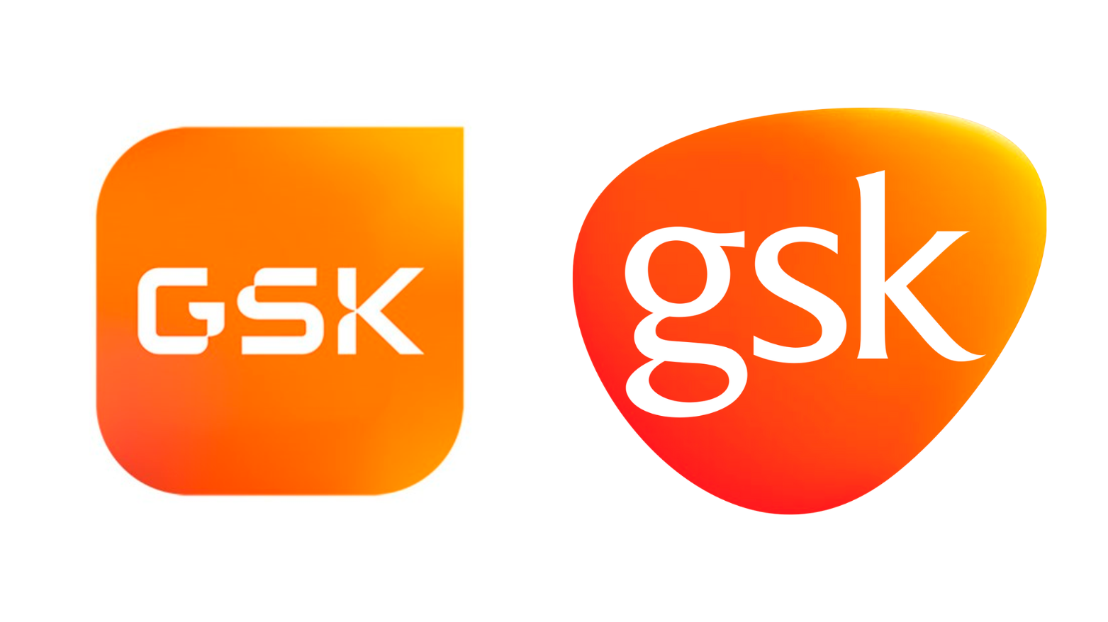
GSK
GSK is a British multinational pharmaceutical & biotechnology company. They wanted to rebrand themselves to symbolise a “unity of science, technology and talent to battle and conquer disease” following their split from their Consumer Healthcare business in the first half of the year.
Their new logo links back to the striking images found in biosciences but still resembles their old logo from the vibrant orange colour palette to the curve forms. This is also seen in their new font which has now a sans-serif font with the curve corners and unique cutout features rather than the previous serif font.
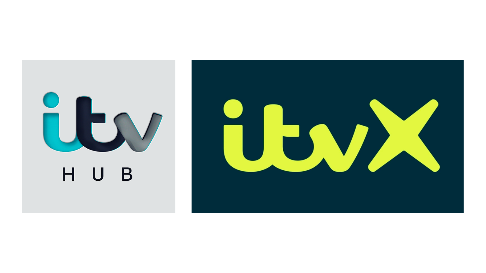
Itvx
Later on in the year we saw ITV launch ITVX and with that a whole new host of logos, colours and marketing aesthetics for their online streaming platform.
ITVX is a new cross-platform entertainment destination set to be different from its competitors such as Netflix and BBC iPlayer.
We think that ITV bringing itself forward to the needs of a technology driven generation is important for the brand to stay relevant, so we can’t wait to see what new series we will be able to binge from them!
One of the rebranding elements we love is the motion graphics in their marketing strategy. The new animations are aimed to represent the personalities of each of their channels as well as spark joy that each of the stories they tell. The personality is also seen in the colour palette that reflects the differences of each ITV channel.
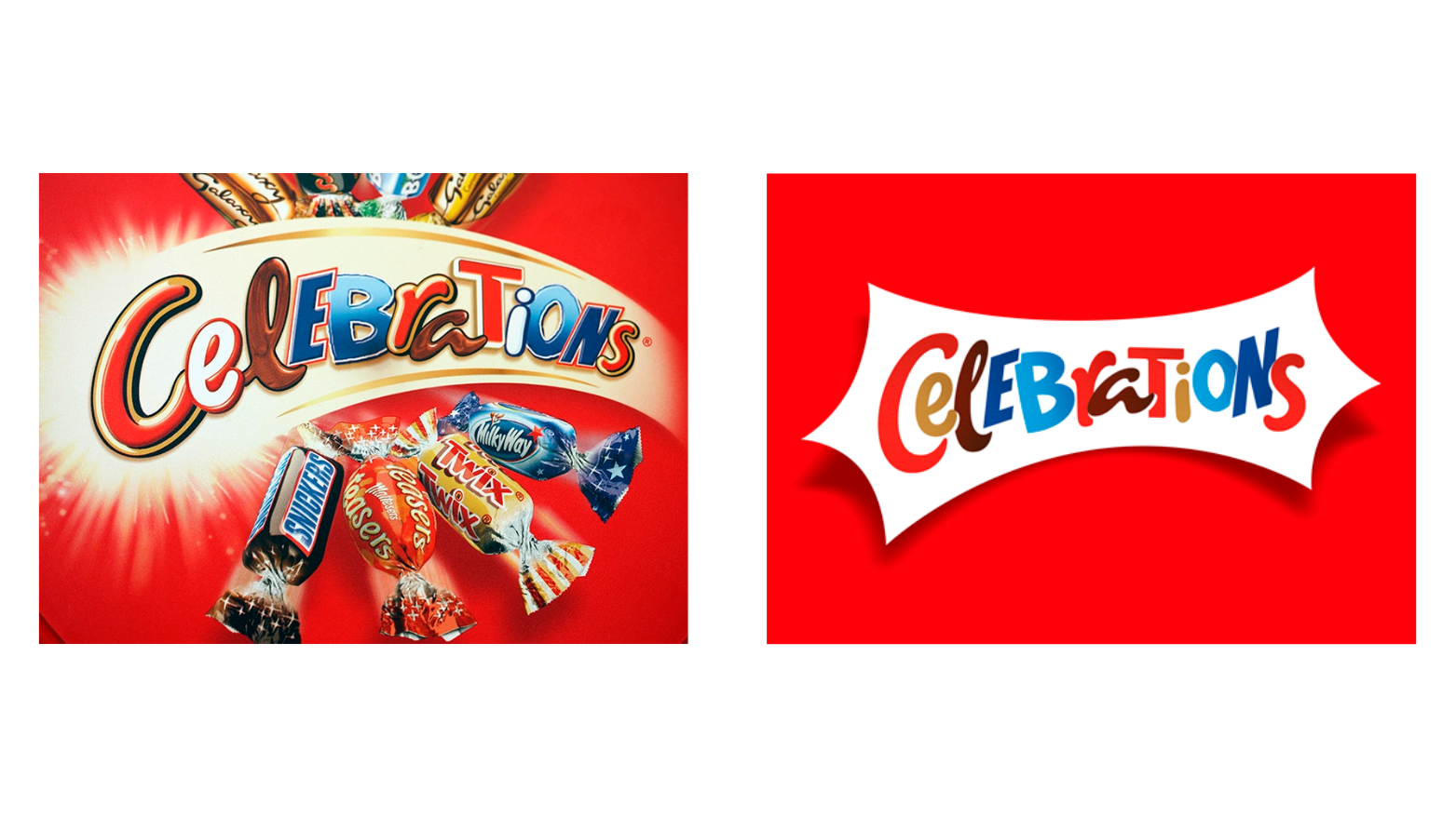
Celebrations
In December, the public were shocked to see one of their favourite festive treats, Celebrations, have re-designed their logo, packaging and wrappers…
They decided to combat being overshadowed by their competitors and wanted to create their own branding for the chocolates the boxes contain to create their own unique factor of the Celebrations as their customers won’t be able to get this branding anywhere else.
We love the new designs for each of the chocolates, with them still having similar qualities to the original wrapper designs through the iconic symbols while still creating a new feel for each of the chocolates in the Celebrations.
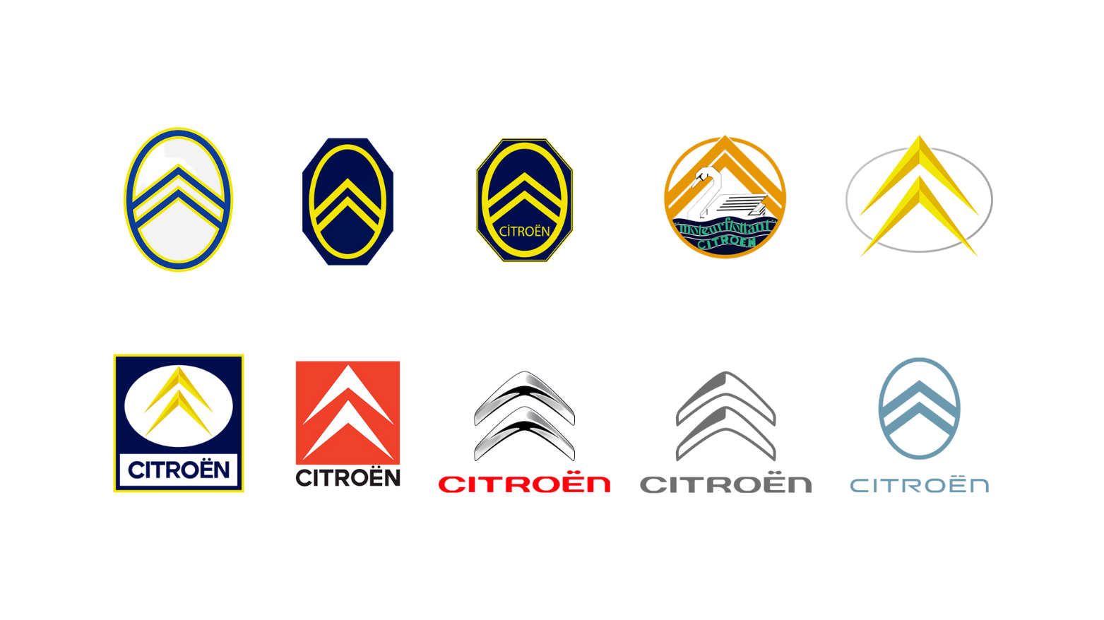
Citroen
When releasing their new Citroen models for 2023, Citroen has also launched their new logo.
This is the tenth version of their logo but still aligns with the brand, keeping the two classic chevrons in the logo. They have to keep this feature in their logo as it’s been the recognisable part of their branding since the company was established, and without these, their audience wouldn’t be able to recognise their branding on their cars from other competitors.
They wanted to create a new logo to launch itself into an all-electric age by making it modern and having a new contemporary look. What we love most about this logo is that calls back to their original logo from 1919, seen in the above photo.
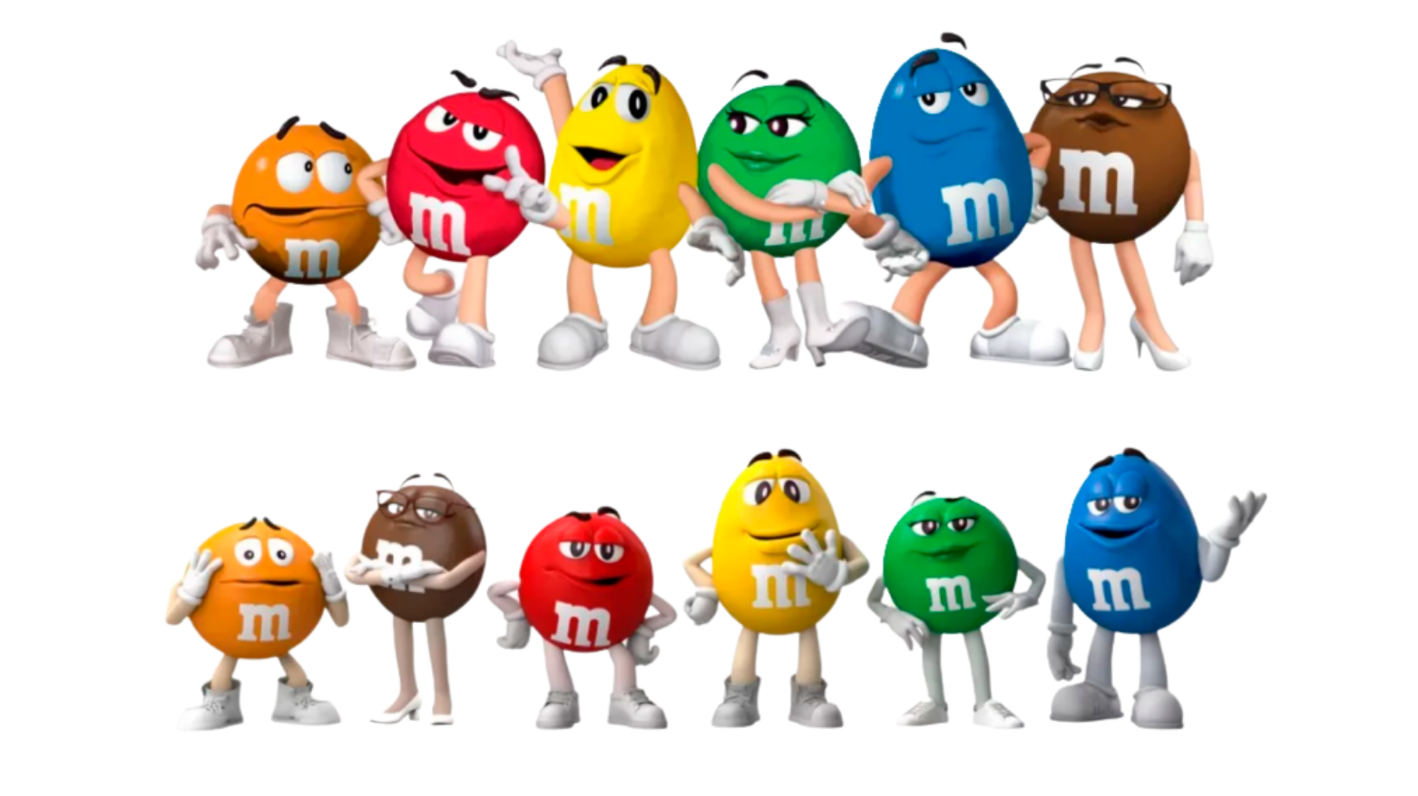
M&Ms
The last brand we are going to talk about is M&Ms. This year we saw them refresh their iconic characters to be more inclusive. We loved this because more brands should be making the step into inclusive marketing.
The mascots now have has subtle changes in their appearances to show the different personalities. One example of this is the green M&M who now wears trainers instead of heels which takes away the female stereotypes it had.
Their rebranding amplifies the message that they want to increase fun and sense of belonging for 10 million people around the world by 2025.
2022 has been a year of change for a lot of brands and we can’t wait to see what other companies choose to rebrand in 2023.