Marketing Purks

Fonts and How They Influence Our Perception
of Brands.

Fonts have an underrated influence.

Image, colour and copy are what people think of as the main weapons in a Graphic Designer’s arsenal.

Yet, as a designer, I have often found that the choice of fonts is one of the most impactful decisions I can make for a brand. Typography has a huge, undeniable influence on consumers.

Graphic design is more than just aesthetic and making a pretty picture. It’s about communicating the right message.

“Typography speaks louder than words.”

Words already have meaning but it’s the designer’s role to give the words more meaning. Most consumers don’t realise the influence a font has on a brand’s tone of voice.

Font choice, typography, is about reading between the lines. It’s the difference between what the words are, what the words need to say and what story they need to communicate to their audience.

Typography speaks louder than words…

Let’s take a look at a real world example:

Nike & Converse

These are two brands that sit in the same industry, they appeal to different audiences and have two different stories they want to tell. Their fonts are instantly recognisable and ultimately represent their ethos. What makes this comparison even more interesting is that Nike owns Converse.

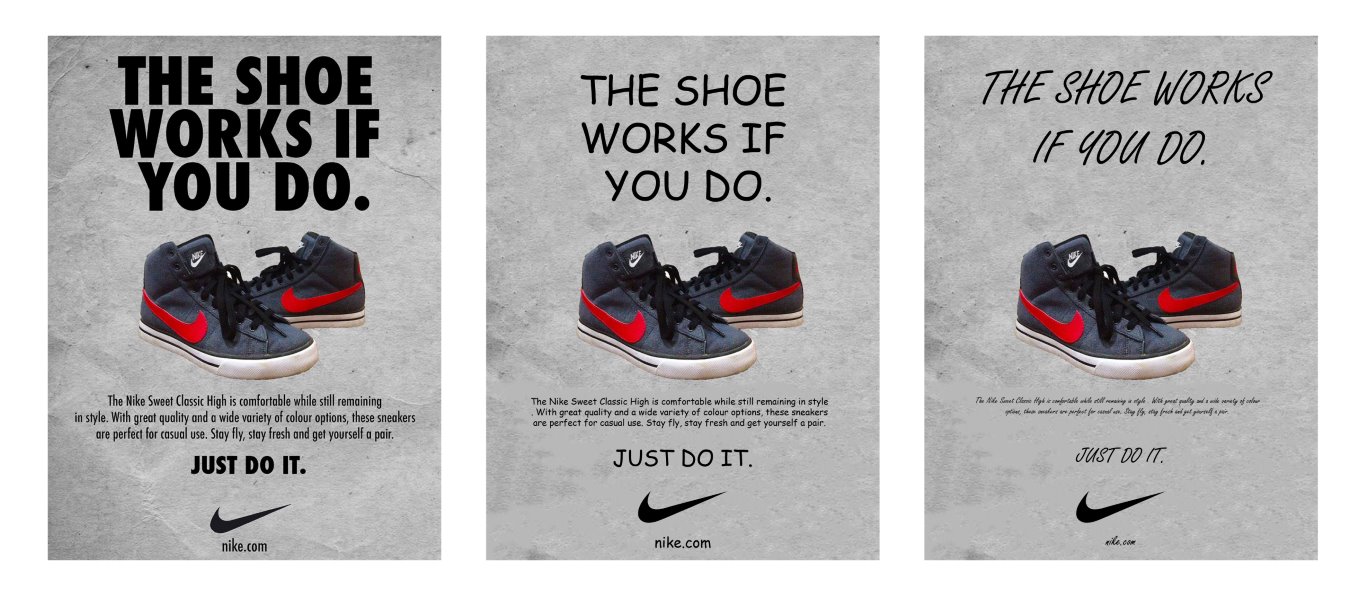
The mission statement for Nike (pronounced ‘Nikey’, sorry to burst some folks’ bubble out there) is about expanding human potential! They focus on creating innovations in sportswear. Their branding and font choices ooze sleek. They’re fashion, they’re active, they’re modern! They are a brand that focuses on the future. 
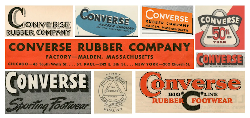
Converse is a casual footwear brand that focuses on its rich history. Their visual identity is instantly recognisable, a staple of pop culture with origins that are 114 years old. They’re retro! They’re cool! They’re indie! Essentially this is a brand that focuses on the past. Let’s take a deeper dive:

Nike’s Fonts are ‘Trade Gothic’ and ‘Futura’ and though we don’t need to go deep into the histories of these two fonts, Futura was often described as the font of today and tomorrow. A spirit of modernity. Minimalism.

Now of course everyone recognises the Nike logo, particularly their ‘Swoosh’, tick emblem.

But how about Nike’s font? The font has embedded itself into your brain just as much.

Nike's swoosh icon logo

Nike ‘Swoosh’ Icon.

Nike's wordmark logo

Nike Wordmark.

What if I told you, the font of Nike feels exactly the same as the ‘Swoosh’.

Both the font and the ‘tick’ are visual representations of the sound of speed.

Nike’s choice in font perfectly reflects the essence of their brand. It’s sharp, bold and modern…

Have you ever wondered why it’s in italics? It makes the word feel faster as if it was moving forward. The word looks like it’s physically leaning over, like a sprinter on a track, ready to pounce into the race!

Imagine if Nike’s choice in sleek font wasn’t so? Below are some examples of different font choices (sorry to my fellow designers for this) to reiterate why Nike’s typography is crucial to its branding and promotional material.

Would Nike even be Nike if it used Comic Sans?

Visual comparison of a Nike outdoor visual ad with alternative typography.

Converse’s logo is a mixture of a wordmark and an icon. A wordmark is like a logo which is text only. Think Google, FedEx, H&M.

Converse’s logo has always been a recognisable staple of western pop culture and recently was given a refresh to nod to its iconic brand history.

Unlike Nike, Converse’s logo font is custom-made. Like Nike, it is ‘Modernist’ and ‘Sans Serif’. In basic terms, this just means it’s minimal and clean.

To the left of the image is a sans serif typeface and to the right a serif typeface. This is to show and compare the difference in font styles.

Comparison of Sans-Serif and Serif Fonts

The latest branding of Converse incorporates the infamous star chevron that’s been in and out of use since the 70s. Its reintroduction meant the brand was rooted in its ‘all American’ history but was moving forward. 

The new logo takes inspiration from past logos from the 1920s and 30s.

Converse Old Branding – Images Courtesy of Converse

The Converse typeface is now an amalgamation of about ‘four/five versions of the wordmark’ to reflect the brand’s past. The font continues to remain nostalgic whilst feeling futuristic.

The font doesn’t feel as sporty as Nike, it isn’t so bold, and it’s much more friendly than the impact, futurism of Nike. But Converse’s demographic is aligned to street fashion and creative culture. Though it has roots in basketball, it’s been adopted as casual, trendy footwear, more so than Nike, so its typography reflects this different audience.

If Converse adopted Nike’s typography the business’s brand ethos and target demographic wouldn’t be represented. The font wouldn’t be communicating the right message. They’d be presenting themselves as a footwear brand for a more active audience.

Despite both being owned by the same company, both understand that branding and importantly type can influence the “feeling” of a brand.

Converse

Converse's logo

Converse’s latest iteration of their logo.

Converse's logo as imagined with Nike's typography

Converse’s wordmark, as imagined with Nike’s typography.

Will you notice how fonts influence your perception of a brand or product now? Next time you’re in a supermarket, or walking down the street, see the word, and more importantly see how they make you think and feel differently about them! 

Jamie Chew

Graphic & Web Designer

Subscribe to our Email Newsletter

Get monthly marketing tips, information on our services, blogs & special offers

Subscribe to our Email Newsletter

Get monthly marketing tips, information on our services, blogs & special offers